
Screenshot to responsive React
Responsive output needs explicit behavior at small, medium, and large viewports. One desktop reference is not enough for production-ready AI output.
Proof-first funnel
Proof signals for higher-confidence decisions
Use these checkpoints before committing spend.
Before / After
Before/after workflow
Capture the goal, generate, review, iterate, and verify before export.
- Plan and cost expectations before build
- Review checkpoints before each restore
- Export only after the acceptance script passes
Restore + Export
Reversible edits and handoff
Keep checkpoints, require scoped rollbacks, and export with manifest, quality report, and deployment instructions.
- One restore creates one explicit new checkpoint
- Restore history stays visible for auditability
- Export includes manifest, report, and deployment files
Spend + Artifacts
Cost clarity and output traceability
Confirm expected credits before run, compare with actual usage, and review exported files before shipping.
- Expected usage shown before generation
- Actual usage and refunds after completion
- Post-build artifacts checked in a clean environment
The short answer
Use viewport rules, component-level ownership, and responsive acceptance tests to convert a screenshot into a stable multi-device React app.
Treat the screenshot as a partial requirement
A screenshot communicates layout intent but not hidden navigation transformations, stacked content, or mobile interaction behavior. Capture these in your prompt and acceptance criteria.
Define responsive transformations by region
For each section, specify behavior for tablet and mobile: collapse, reorder, hide, or stack. This prevents accidental one-size-fits-all output.
Request states that are absent in the screenshot
Loading, error, success, and active states are usually missing in static references and must be explicitly required.
Validate at three widths before judging
Generate for desktop, tablet, and mobile before acceptance, then compare spacing, target sizes, and interaction parity.
Finish with restore and clean export checks
A responsive app is still not production-ready until it restores cleanly and installs in a fresh directory.
Real generated example
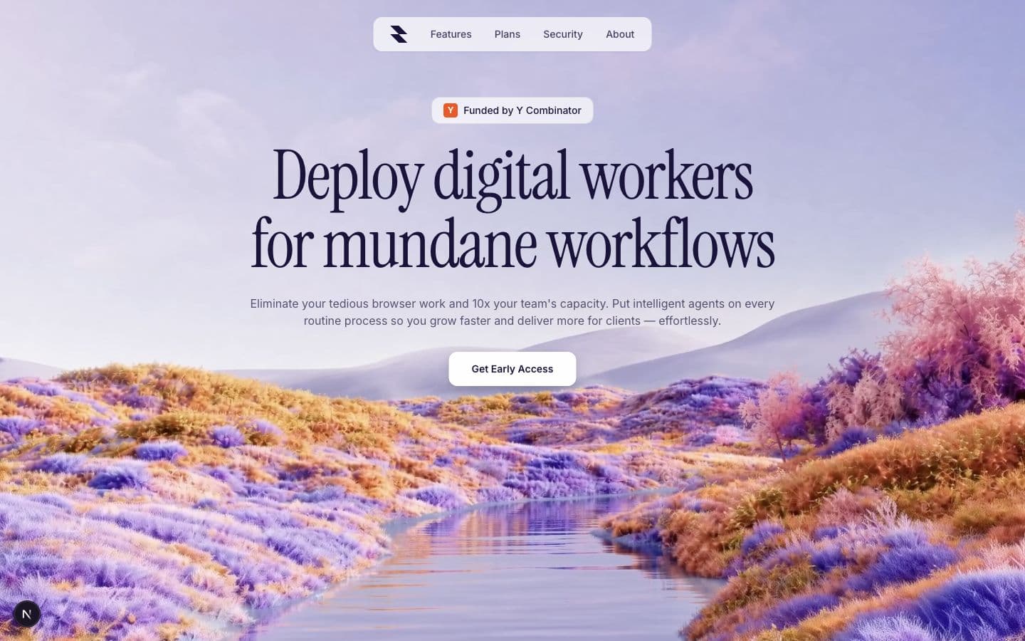
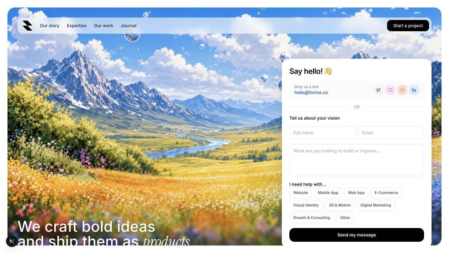
Real example: Responsive landing blocks from a desktop screenshot
Use this concrete example as a starting point, not a final template.
Prompt used
Convert a provided desktop screenshot of a landing hero into a responsive React page. Define desktop/tablet/mobile behavior for navigation, pricing cards, and call-to-action layout, including keyboard-visible focus states.
Generated file inventory
- •src/App.tsx
- •src/components/HeroSection.tsx
- •src/components/ResponsiveGrid.tsx
- •src/components/CTABanner.tsx
- •src/styles/responsive.css
- •src/hooks/useViewport.ts
First-party evidence
Compare responsive outputs against real Squid examples
The gallery provides first-party generated pages at multiple visual densities. The benchmark defines the desktop, tablet, and phone evidence needed to evaluate responsive inference.
Evidence links are maintained by Squid Agent. Product behavior can change; repeat the documented checks against the current project and review date.
FAQ
Frequently asked questions
Direct answers to the questions buyers and builders ask before committing a project to an AI app builder.
Can desktop screenshots reliably infer mobile behavior?
Not reliably. Explicit responsive rules prevent inconsistent shrink behavior and hidden overflow issues.
How should I test multi-viewport quality?
Use the same interaction script on all widths, including touch interactions and spacing checks.
What are the minimum responsive acceptance checks?
No overflow, stable hierarchy, readable typography, and preserved core actions.
Should responsive conversion happen after first generation?
No. It should be planned in the prompt, then verified with separate viewport checks.
Keep researching
Related guides and comparisons
Build an app you can inspect, restore, and keep.
Define your acceptance criteria, confirm expected credits, lock the first checkpoint, and run through the checklist before you export.